Lab 13: Generalized linear models: Poisson Regression
FANR 6750: Experimental Methods in Forestry and Natural Resources Research
Fall 2025
lab13_glm_pr.RmdPoisson regression
This week we will see another situation where using a linear model will not be the most appropriate approach. Here, we are interested in using count data as our response variable and estimating counts as a function of some predictors.
Let’s take a look at a data example to demonstrate this concept. The data are modified from Ver Hoef and Boveng 2007 and include 400 observed counts of harbor seals from aerial surveys conducted in coastal Alaska.
library(FANR6750)
data("harbordata")
head(harbordata)
#>   Survey Number substrate Reltolow      SITE
#> 1      1    250      rock      0.0 Abbess I.
#> 2      2    144      rock      3.2 Abbess I.
#> 3      3      0      rock      4.9 Alava Bay
#> 4      4     42      rock      3.6 Alava Bay
#> 5      5     10      rock      0.0 Alava Bay
#> 6      6      0      rock      1.6 Alava Bay
First let’s visualize the data.
library(ggplot2)

ggplot() +
  geom_point(data = harbordata, aes(x = Reltolow, y = Number)) +
  scale_y_continuous("Count") +
  scale_x_continuous("Tide relative to low (m)")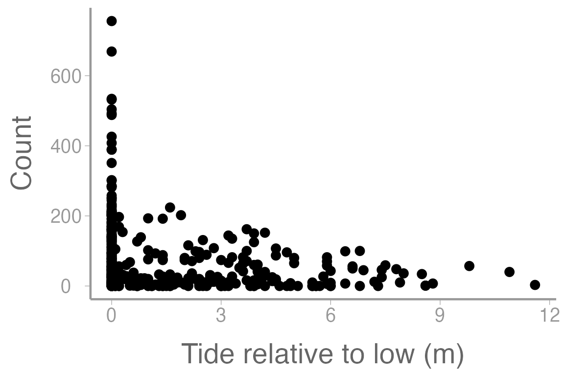
Figure 1: Counts of harbor seals at sites across a range of tide heights (relative to low tide).
Here we are interested in estimating the count of harbor seals during aerial surveys. Like last week, we could start by constructing a model that estimates count as a function of tide height.
mod1 <- lm(Number~ Reltolow, data= harbordata)
summary(mod1)
#>
#> Call:
#> lm(formula = Number ~ Reltolow, data = harbordata)
#>
#> Residuals:
#>    Min     1Q Median     3Q    Max
#>  -92.4  -63.3  -29.0   38.7  663.6
#>
#> Coefficients:
#>             Estimate Std. Error t value Pr(>|t|)
#> (Intercept)    92.39       6.05   15.26  < 2e-16 ***
#> Reltolow      -11.52       2.17   -5.31  1.9e-07 ***
#> ---
#> Signif. codes:  0 '***' 0.001 '**' 0.01 '*' 0.05 '.' 0.1 ' ' 1
#>
#> Residual standard error: 99.4 on 398 degrees of freedom
#> Multiple R-squared:  0.0661, Adjusted R-squared:  0.0637
#> F-statistic: 28.2 on 1 and 398 DF,  p-value: 1.86e-07
Now let’s add our model predictions to the plot from above.
model_pred <- predict(mod1)

ggplot() +
  geom_point(data = harbordata, aes(x = Reltolow, y = Number)) +
  geom_line(aes(harbordata$Reltolow, model_pred), color= 'red') +
  scale_y_continuous("Count") +
  scale_x_continuous("Tide relative to low (m)")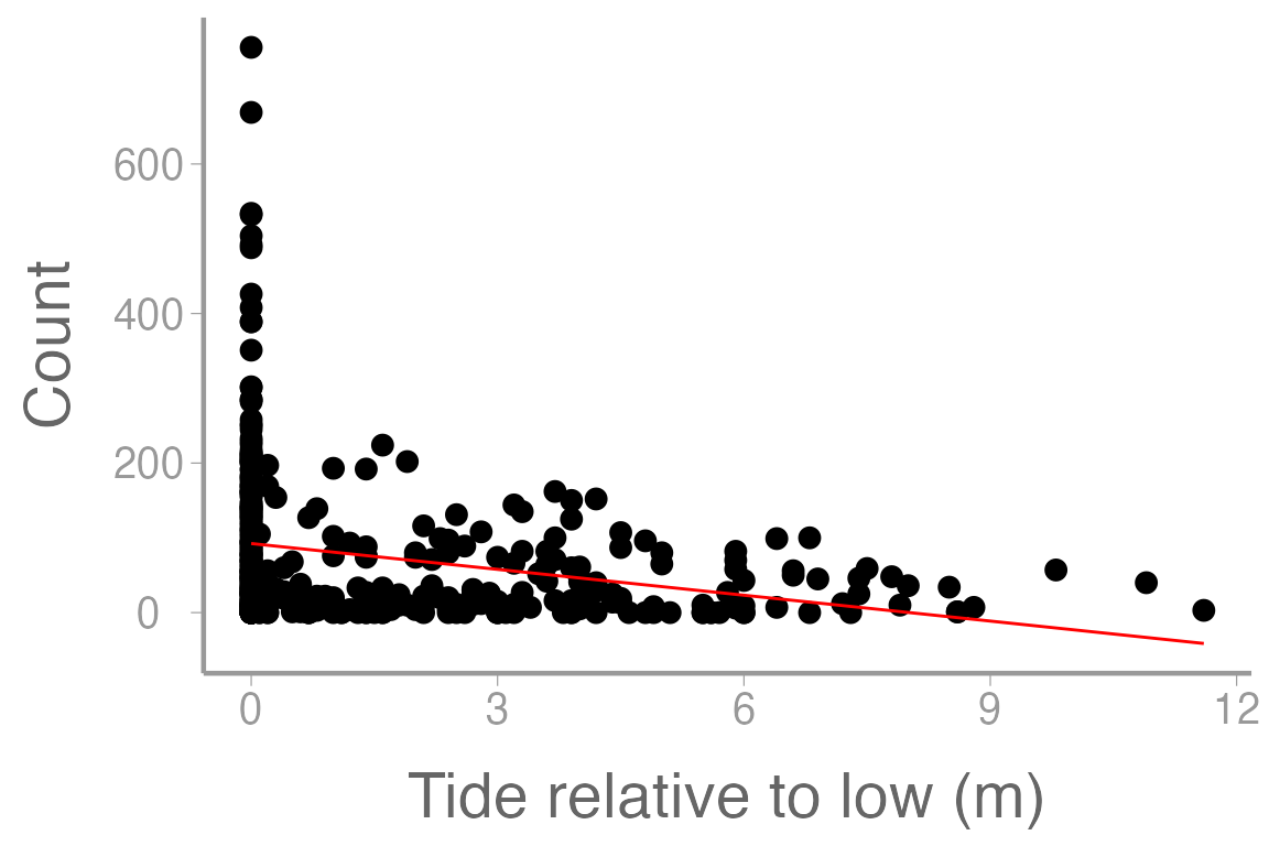
Figure 2: Counts of harbor seals at sites across a range of tide heights (relative to low tide). Line represents model predictions from simple linear regression (mod1)
What issues do you see with this plot? Does this look like a reasonable way to model this response variable?
Similar to last week, we are again presented with a problem. We have an integer count response variable but using a linear model results in unreasonable predictions (since it is not possible for the response to take on values in between the integers or below zero). We can resolve this in a similar way as last week. In that lab, Our data was (0,1) and we needed to create a response variable that could take on values only between zero and one (inclusive) so probability was a reasonable choice. In this case, our response is all possible positive integers but we need a response that can take on all possible positive values. In this case, we can model the mean response () rather than the count observations themselves. We could derive an equation that estimates as a function of our predictor variables:
Now we’ve run into another problem. What is the
issue with this equation in the context of linear modeling?
Instead, we can use a link function (in this case the log link) to create a linear relationship between the response and the predictors.
Remember from lecture that the model for the Poisson regression is:
$$\Large log(\lambda_i) = \beta_0 + \beta_1x_{i1} + \beta_2x_{i2} + · · · + \beta_px_{ip}$$ $$\Large y_i \sim Poisson(\lambda_i)$$
where is the expected value of
Using the harbor data, let’s model the number of harbor seals detected at each site as a function of site substrate and tide height relative to low tide:
fm2 <- glm(Number ~ substrate + Reltolow, family = poisson(link = "log"), data = harbordata)
summary(fm2)
#>
#> Call:
#> glm(formula = Number ~ substrate + Reltolow, family = poisson(link = "log"),
#>     data = harbordata)
#>
#> Coefficients:
#>               Estimate Std. Error z value Pr(>|z|)
#> (Intercept)    5.42280    0.01343   403.7   <2e-16 ***
#> substraterock -1.00615    0.01529   -65.8   <2e-16 ***
#> substratesand -1.28421    0.03586   -35.8   <2e-16 ***
#> Reltolow      -0.19100    0.00386   -49.5   <2e-16 ***
#> ---
#> Signif. codes:  0 '***' 0.001 '**' 0.01 '*' 0.05 '.' 0.1 ' ' 1
#>
#> (Dispersion parameter for poisson family taken to be 1)
#>
#>     Null deviance: 42725  on 399  degrees of freedom
#> Residual deviance: 34227  on 396  degrees of freedom
#> AIC: 36116
#>
#> Number of Fisher Scoring iterations: 6
Notice that we use the family = argument to tell
R that this is a poisson glm with a log link function.
What do the parameter estimates from this model represent, including the intercept? What can we say about the effects of substrate and tide height on harbor seal counts?
As we have seen previously, we can use predict() to
estimate counts at different combinations of tide height and substrate.
For example, how does the predicted count change across tide heights on
ice:
predData <- data.frame(Reltolow = seq(min(harbordata$Reltolow), max(harbordata$Reltolow), length = 10000), substrate= 'ice')To get confidence intervals on the
scale, predict on the log (link) scale and then back transform using the
inverse-link (exp()):
pred.link <- predict(fm2, newdata = predData, se.fit = TRUE)
predData$lambda <- exp(pred.link$fit) # exp is the inverse-link function
predData$lower <- exp(pred.link$fit - 1.96 * pred.link$se.fit)
predData$upper <- exp(pred.link$fit + 1.96 * pred.link$se.fit)

ggplot() +
  geom_point(data = harbordata, aes(x = Reltolow, y = Number)) +
  geom_path(data = predData, aes(x = Reltolow, y = lambda), color= 'red') +
  geom_ribbon(data = predData, aes(x = Reltolow, ymin = lower, ymax = upper),
              fill = NA, color = "red", linetype= 'dashed') +
  scale_x_continuous("Tide relative to low (m)") +
  scale_y_continuous("Expected count")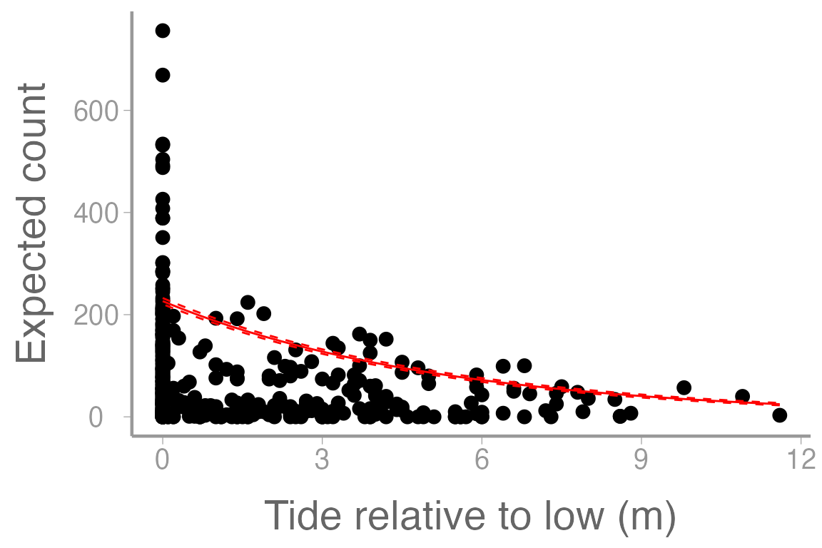
Figure 3: Counts of harbor seals at sites on ice across a range of tide heights (relative to low tide). Line represents model predictions from poisson regression model and dashed lines represent approximate 95% confidence bands.
Although we have completed the analysis, this still may not be the most appropriate way to consider this dataset. What are some issues that you see either from the plot or from the model output related to concepts discussed in lecture?
Why does the fitted line not appear to pass through the data very well?
Negative Binomial Regression
In this dataset, assuming that the mean is equal to the variance may not be a good idea. Especially considering that the mean count is 74.07 and the variance is 1.0558^{4}.
Instead, we could consider using a few other methods. In lecture, we discussed the use of quasi-likelihood estimation (Quasi-Poisson). Here, we will talk briefly about the Negative Binomial (NB) distribution.1
In some sense, the Poisson distribution can be thought of as a specific case of the NB distribution where the mean is equal to the variance. By relaxing this assumption though, we end up with two parameters instead of one (the mean and the ‘dispersion’). This allows for the scenarios where the variance is much larger than the mean (overdispersion).
What are some biological scenarios where we might see this?
Below, we will fit a NB model to the dataset and perform the plotting steps as above to see how our results differ.
library(MASS)

nb1 <- glm.nb(Number ~ substrate + Reltolow, data = harbordata)
summary(nb1)
#>
#> Call:
#> glm.nb(formula = Number ~ substrate + Reltolow, data = harbordata,
#>     init.theta = 0.4661173743, link = log)
#>
#> Coefficients:
#>               Estimate Std. Error z value Pr(>|z|)
#> (Intercept)     5.4190     0.2933   18.48  < 2e-16 ***
#> substraterock  -1.0372     0.3077   -3.37  0.00075 ***
#> substratesand  -1.3827     0.4500   -3.07  0.00212 **
#> Reltolow       -0.1608     0.0327   -4.92  8.8e-07 ***
#> ---
#> Signif. codes:  0 '***' 0.001 '**' 0.01 '*' 0.05 '.' 0.1 ' ' 1
#>
#> (Dispersion parameter for Negative Binomial(0.4661) family taken to be 1)
#>
#>     Null deviance: 532.29  on 399  degrees of freedom
#> Residual deviance: 484.04  on 396  degrees of freedom
#> AIC: 4009
#>
#> Number of Fisher Scoring iterations: 1
#>
#>
#>               Theta:  0.4661
#>           Std. Err.:  0.0319
#>
#>  2 x log-likelihood:  -3999.4500

predDatanb <- data.frame(Reltolow = seq(min(harbordata$Reltolow), max(harbordata$Reltolow), length = 10000), substrate= 'ice')

pred.linknb <- predict(nb1, newdata = predDatanb, se.fit = TRUE)
predDatanb$lambda <- exp(pred.linknb$fit) # exp is the inverse-link function
predDatanb$lower <- exp(pred.linknb$fit - 1.96 * pred.linknb$se.fit)
predDatanb$upper <- exp(pred.linknb$fit + 1.96 * pred.linknb$se.fit)

ggplot() +
  geom_point(data = harbordata, aes(x = Reltolow, y = Number)) +
  geom_path(data = predData, aes(x = Reltolow, y = lambda, color= 'Poisson')) +
  geom_ribbon(data = predData, aes(x = Reltolow, ymin = lower, ymax = upper, color= 'Poisson'),
              fill = NA, linetype= 'dashed') +
  geom_path(data = predDatanb, aes(x = Reltolow, y = lambda, color= 'Negative Binomial')) +
  geom_ribbon(data = predDatanb, aes(x = Reltolow, ymin = lower, ymax = upper, color= 'Negative Binomial'),
              fill = NA, linetype= 'dashed') +
  scale_x_continuous("Tide relative to low (m)") +
  scale_y_continuous("Expected count")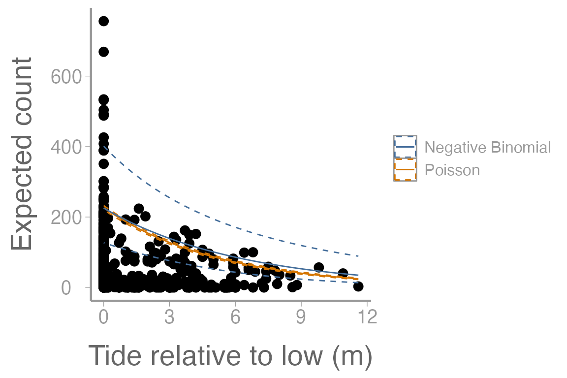
Figure 4: Counts of harbor seals at sites across a range of tide heights (relative to low tide). Solid lines represent model predictions from poisson regression model and negative binomial regression model. Dashed lines represent approximate 95% confidence bands.
In what ways do the model predictions from the NB regression differ from the Poisson regression? Compare the information provided by the model output from each model.
Assignment
Researchers are interested in understanding factors which affect alligator clutch size (number of eggs). 350 nests were surveyed across 3 habitat types. During the surveys, the clutch size was recorded as well as the length of the female alligator.
The data can be loaded using:
Create an R markdown report to do the following:
Use both regression methods discussed in lab (Poisson and NB) to estimate clutch size as a function of the available predictors (2 pt)
Include a well-formatted summary table of the parameter estimates from both models (1 pt)
Choose one of the models and provide a clear interpretation of the parameter estimates (1 pt).
-
Use the poisson regression model to plot the relationship between number of eggs and female length, for all three habitat types, on the same graph. The graph should include (1 pt):
the observed data points (color coded by habitat)
a legend
approximate 95% confidence intervals
-
Create a plot of the relationship between number of eggs and female length (at one of the three habitat types) using both regression methods on the same graph. The graph should include (1 pt):
the observed data points
a legend
approximate 95% confidence intervals
Interpret the plot from Question 5. Which regression method do you think is most appropriate for this dataset? Justify your decision (2 pt)
As always:
Be sure the output type is set to:
output: html_documentBe sure to include your first and last name in the
authorsectionBe sure to set
echo = TRUEin allRchunks so we can see both your code and the outputSee the R Markdown reference sheet for help with creating
Rchunks, equations, tables, etc.See the “Creating publication-quality graphics” reference sheet for tips on formatting figures